”The Real Story of January 6,” a documentary by The Epoch Times, reveals the truth that has been hidden from the American people. While a narrative has been set that what took place that day was an insurrection, key events and witnesses have been ignored, until now. The documentary takes an unvarnished look at police use of force and the deaths that resulted in some measure from it. The film asks tough questions about who was responsible for the chaos that day. With compelling interviews and exclusive video footage, the documentary tells the real story of January 6.
While the dust from Jan. 6, 2021, has long cleared, it has been replaced by a smoke screen. A carefully crafted narrative has been set that claims the events of that day amounted to a “violent insurrection.” This claim, however, does not match the facts. “The Real Story of January 6” takes an objective look at what happened through the eyes of those who were there. The Epoch Times provides the first comprehensive look into what really happened that day. The Truth can’t be hidden.
We are Being Censored, Help Spread This Documentary
While this documentary is groundbreaking in providing a complete overview of what happened on January 6, The Epoch Times has been censored and suppressed by Big Tech. In order to spread the documentary, The Epoch Times relies on its own Epoch TV as well as other non-cancelable platforms to spread the truth. Stand up for free speech and oppose censorship by sharing the documentary with as many people as you can.
“My conclusion was that this [shooting of Ashli Babbitt] was not reasonable in any way. Based on what I saw and observed in the video clip, Ashli Babbitt was murdered. She was shot and killed under color of authority by an officer who violated not only the law but his oath and committed an arrestable offense.” ~ Stan Kephart. Police use of force expert.
Police Practices: Policy & Operational Standards, Training, Use of Force, Officer Involved Shootings, Pursuits, International and domestic qualifications in riot and insurrections for crowd control
“We have taken action to protect the integrity of our elections by making ballot harvesting a felony, strengthening voter ID, eliminating drop boxes, and banning Zuckerbucks.” ~ Ron DeSantis, Governor of Florida.
CCGG indicates that these are individual flask measurements of CO2 concentration by the Mauna Loa laboratory. The two averages were each an average of 4 flask measurements each day.
There was a time when it was possible to point out an error by way of a rebuttal published as a note in a scientific journal – even in the journal Nature, even when it went against the catastrophic anthropogenic global warming agenda. The late Patrick Michaels had a note published back in 1996 (vol. 384, pg. 522) explaining that there was a major error in research findings by Ben Santer – findings so significant they underpinned the key claim in the second IPCC report that ‘The balance of evidence suggests a discernible human influence on global climate.’
Pat Michaels’ career spanned the emergence of global warming as the dominant paradigm underpinning not just atmospheric research but more recently energy policy. His death last week represents not only the loss of a great intellect but also the end of an era.
Pat Michaels is a past president of the American Association of State Climatologists, program chair for the Committee on Applied Climatology of the American Meteorological Society, research professor of Environmental Sciences at University of Virginia for 30 years and contributing author and reviewer of the United Nations Intergovernmental Panel on Climate Change (IPCC) reports – reports that more than anything else created the modern illusion of catastrophic warming.
Nowadays a television news bulletin almost always includes climate change – based on the assumption that there is something unusual about the modern climate; that it has been so perturbed by human activity we are heading for catastrophe. There will be some moralising, and an appeal to the authority of science. Some are animated by these reports, some are frightened, but very few can place any of this in any meaningful historical context. If we could, then we would realise that the fear of human-caused climate change is a recent phenomenon. The late Patrick Michaels understood how public choice theory in economics combined with an almost textbook example of how nonsense paradigms can take hold in scientific research created the current faux narrative.
The IPCC was established by the World Meteorological Organisation (WMO) and the United Nations Environmental Programme (UNEP) in 1988 to assess available scientific information on climate change, assess the environmental and socio-economic impacts of climate change, and formulate response strategies. The first IPCC assessment report (AR1) was published in 1990, the second (AR2) in 1995, the third (AR3) in 2001, and the sixth and most recent just last August 2022 (AR6). Each IPCC report consists of reviews of ostensibly scientific work on climate, divided into chapters. Each chapter has several lead authors, plus a number of contributors. In the Second Assessment Report (AR2) it is stated on page 4 that:
The balance of evidence suggests that there is a discernible human influence on global climate.
This was the first unequivocal claim of a human influence on climate being reported by the world’s leading experts and in an authoritative report. That sentence was read and reported by opinion leaders around the world as a breakthrough; such is the reach of the IPCC assessment reports.
The claim was based on the work of Ben Santer, a physicist and atmospheric scientist at the Lawrence Livermore National Laboratory in California, whose job it was to model the effects of human-caused climate change. The nature of his research led to his appointment as the lead author of Chapter 8 of the 1995 report (AR2).
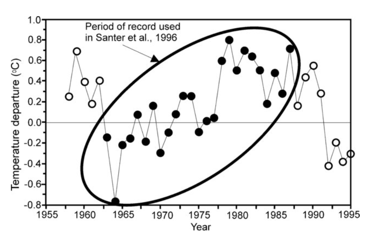
Ben Santer hadn’t actually published the key study on which this claim was based at the time of AR2, in 1995. The research was not published until the next year, 1996. As soon as it was published, it was fact checked by Patrick Michaels who subsequently published the devastating critic in the journal Nature.
Ben Santer’s ‘fingerprinting’ study looked for geographically-limited patterns of observed climate change to compare with patterns as predicted by general circulation models (GCMs). The idea was that by finding a pattern in the observed data that matched the predicted model, a causal connection could be claimed. Except that Patrick Michaels showed that the research on which the key 1995 IPCC ‘discernible influence’ statement is based had used only a portion of the available atmospheric temperature data.
The Santer study was terribly flawed because of the fallacy of incomplete evidence – also known as cherry picking.
Patrick Michaels explained the problem in the chapter he wrote for Climate Change: The Facts 2017. (That chapter has just been made available online courtesy of the IPA, click here.)
The peculiarity of the [Ben Santer] paper was that it covered the period from 1963 to 1987, although the upper-air data required for a three-dimensional analysis was reliably catalogued back to 1957 – by one of the paper’s thirteen authors – Abraham Oort of the Geophysical Fluid Dynamics Laboratory in Princeton. The starting date of 1963 was also a very cool point in global records, as temperatures were chilled by the 1962 eruption of Indonesia’s Mount Agung, one of the four large stratovolcanoes in the twentieth century, and the biggest since Alaska’s Katmai in 1912.
The year 1987 also seemed to be an odd ending point. Data were certainly available through to 1994, seven years later, and updatable through to 1995. It is noteworthy that 1987 was an El Niño year, and therefore relatively warm compared to the rest of the study period.
The match between the observed three-dimensional temperature profile and the modelled profile was persuasive because of the projected difference between warming in the two hemispheres, with a substantial ‘hot spot’ – both simulated and observed – in the lower and mid-tropospheric Southern Hemisphere …
However, the omission of data from the years 1957–62 and 1988–95 was puzzling. The reason these data were not included became clear when I added them in. If all the data were used, there would have been no significant match between the modelled and observed data. Santer et al. simply discarded the data that didn’t fit their preconceived hypothesis.
Pat Michaels showed that when the full data set is used, the previously identified warming trend disappeared. His thoughtful rebuttal, published in a peer-reviewed journal, could have been a game changer. But there was an extraordinary lack of political will to do the right thing that exists to this very day. There is a complete lack of political will to call out the fake findings.
Back in 1996, because of Patrick Michaels scholarly rebuttal in Nature (co-authored with Chip Knappenberger, vol 384, pg. 522), Ben Santer should and could have been hauled before a commission and the entire IPCC process quashed.
Pat Michaels took the time to explore the data underpinning the key finding of the second IPCC assessment report and he showed it to be deficient. His summary of the cherry picking unequivocally showed-up the conclusion to be unjustified because it only included a segment of the available data.
Pat Michaels, the scientist, had loaded the gun with that note published in Nature in 1996. But there was no politician prepared to pull the trigger. Now it is impossible to even get this type of rebuttal published.
If a process of overhauling the IPCC had been put in place back then, back in 1996, there would have been no Third Assessment Report (AR3) and arguably no global-warming hockey stick chart that went onto seal the fate of rational evidence-based discussion about global climate change.
Pat Michaels went on to include public choice theory in his writings. He would emphases that it does not judge someone’s honesty or dishonesty. It simply implies that the structure of incentives that climate scientists are currently presented with creates a bias of distortion, in which problems must be exaggerated in order to garner funding … and that this political process creates a symbiotic relationship between politicians and scientists that works to both their advantage. Scientists get resources for their research, and responsive politicians can tout their funding of virtuous causes.
On the reality of climate change Pat Michaels explained:
We know, to a very small range of error, the amount of future climate change for the foreseeable future, and it is a modest value to which humans have adapted and will continue to adapt. There is no known, feasible policy that can stop or even slow these changes in a fashion that could be scientifically measured.
Pat Michaels was interested in measurement, and its statistical significance. And he was prepared to be bold and have his inconvenient findings published and then he was prepared to be interviewed about them and explain it all in plain English. There are so few of them anymore at government institutions – as far as I can tell most publicly-funded climatologists are full of hyperbole or cowardice.
The key rebuttal published in Nature is Michaels, P., Knappenberger, P. Human effect on global climate? Nature 384, 522–523 (1996). https://doi.org/10.1038/384522b0
Atmospheric CO2 concentration today is the same as it would be if humans never existed. God, knowing that humans would mess up His work, arranged the laws of chemistry and physics such that humans cannot permanently increase or decrease CO2 in the atmosphere by adding or subtracting CO2. Any increase or decrease is a temporary disturbance to the ongoing trend in CO2 concentration.
Diffusion of CO2 gas into and out of the surface of water is controlled by the molecular weight of CO2 and the temperature of the water’s surface. More specifically, the diffusivity coefficient of any gas into the surface of any liquid is a function of the inverse of the square root of the molecular weight of the gas.
Humans adding or removing CO2 gas into or out of the atmosphere does not alter the fixed ratio of non-ionized CO2 gas in the ocean surface versus CO2 gas in the air above the surface. The amount of CO2 gas added to the atmosphere by humans burning fossil fuels only temporarily disrupts the ratio, then the two relative concentrations reset to the ratio set by the molecular weight and temperature of the surface. This is Graham’s Law and Henry’s Law, both laws are well known to chemists and chemical engineers since the 1800s, but largely ignored by climatologists. These laws apply to the diffusion of all trace gases into and out of all liquids, for example gas diffusion into and out of lung tissue, and diffusion into and out of plant tissue, and scientific measurements by gas chromatography.
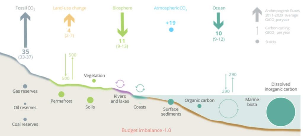
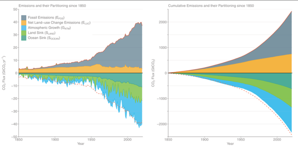
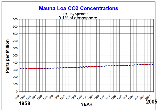
The following graph is usually shown in schools, the media and by government agencies. This is the record of measurements of net global average CO2 concentration in dry air. The black line is the average of the red line. The red line is the difference between total CO2 absorption by all of nature and humans versus total CO2 emissions by all of nature and humans. It is commonly called “The Keeling Curve”. This is NOT human emissions, though that is rarely mentioned. As will shown in this paper, human emissions are far too small to be shown on the Keeling curve as it is normally represented. The Keeling curve is net global average CO2 concentration in the atmosphere due to all sources, human and natural. “Net” means total absorptions of CO2 into all sinks have been subtracted from total emissions of CO2 from all sources.
Note in the graph above, the left-hand vertical axis is parts per million (ppm) of CO2 gas in dry atmosphere; that is, 1 molecule of CO2 gas and 999,999 molecules of air, mostly nitrogen and oxygen.
If we take these same NOAA/Scripps data as shown above and plot it more realistically, we get the following graph by Dr. Roy Spencer. He plotted the same data as above but with the left-hand vertical axis set to the data range of zero to 1 million ppm. Keep in mind that this is net global average CO2 concentration from all sources human and natural, not human CO2 concentration.
Does this amount of growth of CO2 look like something to fear?
And in the next few graphs, Dr. Spencer plots again the same data as above, but merely changes the left-hand vertical axis to show how this changes the perception of the data.
The following Keeling curve graph is the same data as all of the above graphs. Notice that it plots only 0.01% of the atmosphere, i.e., 100 ppm CO2 per 1,000,000 ppm of atmosphere. The left-hand vertical axis is now only about 320 ppm to about 420 ppm. The left-hand vertical axis has been changed to create the perception of rapid growth of CO2.
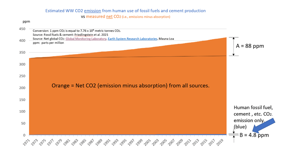
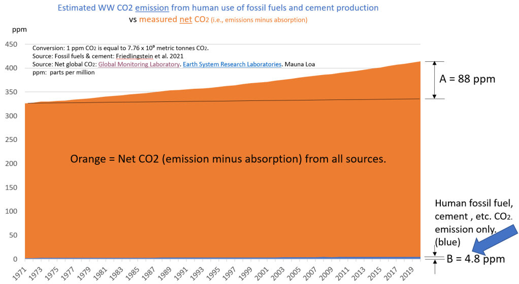
The orange triangle in the graph below is the increase in net CO2 concentration due to all sources human and natural since 1971, which is 88 ppm. The non-rectangular orange quadrangle is net global atmospheric concentration. These are measured by NOAA/Scripps at Mauna Loa. It is not a theory, estimate, or computer model. The barely visible blue quadrangle is average total human emissions between 1971 and Dec 31, 2020, based on the 4.8 ppm Friedlingstein et al calculation for 2020. But even this 4.8 ppm is too high because this is human emissions only, i.e., the amount of human CO2 emissions which were absorbed into the environment in 2020 have not been subtracted from calculated human CO2 emissions in 2020. We cannot subtract it because we do not know how much human CO2 is absorbed. So, this blue quadrangle area is human emissions only.
Let’s estimate maximum possible net human emissions:
• 2 Jan 2020, MLO reported 4 CO2 flask measurements for Jan 2, 2020. Average 412.9875 ppm • 31 Jan 2020, MLO reported 4 CO2 flask measurement for Jan 31, 2020. Average 415.5225 ppm • Then, CO2 measured increase due to all sources, human and natural combined, for year 2020 is 2.5 ppm, (i.e., 415.5 ppm minus 413 ppm.)
Friedlingstein, et al., calculate human emissions is 4.8 ppm for 2020. 4.8 ppm minus 2.5 ppm equals 2.3 ppm. Thus, based on Friedlingstein et al, the implied net human emissions cannot exceed 2.3 ppm for 2020.
Note, on the NOAA/Scripps “Keeling curve” above titled “Atmospheric CO2 at Mauna Loa Laboratory” and as typically shown to the public, the lower end of the left-hand vertical axis is chopped off below about 310 ppm. In other words, maximum possible human emissions at 2.3 ppm in 2020 cannot be shown on the Keeling curve.If maximum possible net human emissions of 2.3 ppm in 2020 were plotted on Dr. Roy Spencer’s graph of 0.1% of the atmosphere, then maximum possible net human emissions would appear as a nearly flat line barely distinguishable from the horizontal axis.
Net human emissions may be compared to net global emissions by comparing the area of the orange quadrangle to the area of less than half of the barely visible blue quadrangle in the graph below, since both are CO2 amounts which are cumulating over time.
The blue human area is about 113 ppm years. The orange net total area is about 18205 ppm years. 113 divided by 18205 is about 0.62%. Thus, using the implication of Friedlingstein et al estimates, net human emissions cannot exceed 0.62% of net global CO2 emissions. 18205 divided by 113 is about 161. So, net average global CO2 concentration is about 161 times maximum possible net human CO2 emissions.
Let’s compare the two slopes, i.e., the two growth rates. Recall the formula for slope is y = mx + b. Using 49 years (i.e., 1971 to 2020), the x = 49 years for both. As shown above, by the end of 2020, net human emissions can not exceed 0.62% of net global CO2 concentration. Let’s assume that same percentage applied in 1971. Thus 0.0062 times 327.5 ppm in 1971 = 2 ppm = b, (i.e., the y intercept in the calculation of net human CO2 growth rate.) The maximum possible human y value is 2.3 ppm, based on Friedlingstein et al., as shown above. Then, for net global CO2 rate of change, 327.5 ppm in 1971 is b (i.e., the y intercept), and 415.5 ppm is y, for net global emission at the end of 2020.
Calculating these two slopes, then the maximum possible average annual rate of growth of net human emissions is 0.0061 ppm per year. Meanwhile, the average annual rate of growth of net global CO2 concentration is 1.8 ppm per year. In other words,theaverage annual growth rate of net global CO2 emissions is 295 times faster than average annual growth rate of maximum possible net human emissions.
Obviously, human CO2 emissions are trivial and negligible with regard to net global CO2 concentration and rate of change of net global CO2 concentration.
There is also an important point of logic to be made here: If human CO2 were causing the increase in total CO2, then the slope of human CO2 net emissions MUST BE either parallel to the slope of net total emissions or else intersect the slope of net total emissions. For a cause-and-effect relationship to exist, then there MUST BE a positive correlation between the hypothetical cause and the hypothetical effect; THERE ARE NO EXCEPTIONS. Since the slope of the blue line and the slope of the orange line are diverging over time, then the correlation is negative. In other words, the rate of increase in human CO2CANNOT BE causing the rate of increase in total CO2. This means human CO2CANNOT BE the cause of, nor forcing, ANY significant effects (positive or negative) which co-vary with net global CO2 concentration. These co-variables include climate change, warming or cooling, increased tree growth, increased greening, hurricanes, extinctions, drought, etc.
References:
Dr. Roy Spencer’s presentation can be viewed or downloaded at the link below.
Dlugokencky, E.J., J.W. Mund, A.M. Crotwell, M.J. Crotwell, and K.W. Thoning (2021), Atmospheric Carbon Dioxide Dry Air Mole Fractions from the NOAA GML Carbon Cycle Cooperative Global Air Sampling Network, 1968-2020, Version: 2021-07-30, https://do.i.org/10.15138/wkgj-f215
Friedlingstein et al. Friedlingstein, P., Jones, M. W., O’Sullivan, M., Andrew, R. M., Bakker, D. C. E., Hauck, J., Le Quéré, C., Peters, G. P., Peters, W., Pongratz, J., Sitch, S., Canadell, J. G., Ciais, P., Jackson, R. B., Alin, S. R., Anthoni, P., Bates, N. R., Becker, M., & Bellouin, N., (2021) Global Carbon Budget 2021, Earth Syst. Sci. Data Discuss. [preprint], https://doi.org/10.5194/essd-2021-386https://essd.copernicus.org/preprints/essd-2021-386/essd-2021-386.pdf
Henry, W. (1803). Experiments on the quantity of gases absorbed by water, at different temperatures, and under different pressures. Phil. Trans. R. Soc. Lond. 93: 29–274. https://doi.org/doi:10.1098/rstl.1803.0004
Thoning, K.W., Crotwell, A.M., & Mund, J.W. (2021). Atmospheric carbon dioxide dry air mole fractions from continuous measurements at Mauna Loa, Hawaii, Barrow, Alaska, American Samoa and South Pole. 1973-2020, Version 2021-08-09. National Oceanic and Atmospheric Administration (NOAA), Global Monitoring Laboratory (GML), Boulder, Colorado, USAhttps://doi.org/10.15138/yaf1-bk21 Data Set Name: co2_mlo_surface-insitu_1_ccgg_DailyData. Description: Atmospheric carbon dioxide dry air mole fractions from quasi-continuous measurements at Mauna Loa, Hawaii.
Erroneous assumptions based on the 1958-1964 works of Bert Bolin are deep in the orthodoxy of human-CO2-caused global warming /climate change. Bert Rickard Johannes Bolin (1925 – 2007) was a Swedish meteorologist who served as the first chairman of the UN’s Intergovernmental Panel on Climate Change (IPCC), from 1988 to 1997. “Bolin is credited with bringing together a diverse range of views among the panel’s 3,500 scientists into something resembling a consensus.” (Sundt, Nick. 1995.) He was professor of meteorology at Stockholm University from 1961 until his retirement in 1990. Bolin’s papers were based on differential equations, calculus and assumed analogies in science. Bolin’s work omitted critical information and calculations.
Bolin’s math was elegant. And it is true, as he derived, that diffusion of CO2 gas and dissolved inorganic and organic carbon in the ocean water column is the rate limiting variable in vertical migration in the ocean water column.
The problems with Bolin are not in the calculations which he included, and which are referenced today in UN IPCC orthodoxy, as well as by many skeptics still today. The problems are the facts and math which Bolin omitted. Bolin derived and integrated the CO2 gas migration rate and dissolved carbonate reaction rates in the vertical water column in ocean. From there he derived the thickness of a thin layer of ocean surface that implies the observed slope of CO2 concentration (e.g., the Keeling curve) could not be CO2 emissions from the ocean. Bolin’s calculations showed the CO2 migration rate in ocean was too slow, and “chemical enhancement” (which were the reactions and rates of the series of carbonate reactions) was insufficient in his derived thin layer at the top of the vertical ocean water column.
And it is true that the CO2 gas migration is the rate limiting step in the vertical ocean water column. However, CO2 gas and dissolved carbon do not need to migrate horizontally or vertically in order to reverse react and produce CO2 gas emissions from ocean surface. The various carbonate ions and ionized CO2 gas are perpetually surrounded by water ions as well as calcium ions in ocean surface. Bolin considered in his calculations the thin layer as well as the well-mixed layer, the top 2 layers (~20 meters to ~100 meters) of the ocean water column. But, Bolin omitted ocean surface area. Using the chemical enhancement and migration rate in the vertical ocean water column in calm surface Bolin and Erik Eriksson (1959) concluded, “It is obvious that an addition of C02 to the atmosphere will only slightly change the C02 content of the sea but appreciably effect the C02 content of the atmosphere. It is possible to deduce a relation between the exchange coefficient for transfer from the atmosphere to the sea and the corresponding coefficient for the exchange between the deep sea and the mixed layer.” (Underlining and bolding by Bud)
The white chalk cliff of east Sussex, England
How then does ocean contain 40 to 50 times the amount of CO2 as air according to geology and ocean chemistry? What, for example, formed the famous white cliffs of Dover and Sussex, England and Normandy, France? That relation and those coefficients are expressed in Henry’s Law, Graham’s Law, and Fick’s Law. Those white cliffs were once CO2 in the air which was absorbed into the ocean and incorporated into sea life or precipitated as one of the forms of solid calcium carbonates such as limestone. Bolin was almost there. But, these laws apply at the gas-liquid exchange interface, that is sea surface and all water surface exposed to air, but not to deep sea and the well mixed middle layer, or even 10 centimeters below a calm surface, nor do they apply to the various atmospheric layers above the thin layer at the surface.
Bolin (1960) states, “The transfer of carbon dioxide through the atmosphere and the sea takes place by turbulent processes except possibly in the intermediate vicinity of the sea surface where molecular diffusion may play a role at least in the case of a smooth surface. The transfer across the sea surface is dependent on the number of molecules colliding with the interphase and being retained in the water when coming from the air and vice versa.”
Bolin omitted from his calculations (a) the phase-state equilibrium reaction that applies to non-ionized CO2 gas in ocean surface and (b) the several acid-base carbonate system equilibrium reactions that apply to ionized CO2 when both (a) and (b) are occurring in about 361 million square kilometers of ocean surface thin layer! Perhaps I am missing something in hidden derivation steps, but it appears Bolin only considered an ocean surface area of 2 X 10⁻⁵ cm2. I have not found any consideration of the horizontal surface area of the ocean in his papers, even though it is equally important to ocean thin layer thickness in calculating the diffusion rate of CO2 gas into or out of the ocean. This is a huge error of omission which UN IPCC orthodoxy uses to deny that the slope of CO2 concentration could be due to natural emissions from ocean surface.
Net diffusion flux of a gas through a surface is specified by Fick’s Law. The area of the gas exchange surface is equally important as the thickness of the exchange surface in Fick’s Law. Why did Bolin omit ocean surface area? Flux is the mass (or moles) of CO2 gas diffusing through a surface area in a unit of time, for example, gigatonnes of CO2 gas emitted per square kilometer per day.
On the other hand, Bolin’s calculations of turbulence in the vertical ocean water column leading to the rapid vertical migration rate of CO2 and dissolved carbonates, and eventual emission of CO2 gas into air are important parts of the explanation for the large effect of El Ninos on CO2 atmospheric emissions and rates of change of CO2 concentration. Bolin stated, “For a rough sea surface the transfer velocity [for the exchange of CO2, between the atmosphere and the sea] may be 10 to 100 times larger.” ..than a smooth surface. Turbulence increases both the temperature of the water and the surface area.
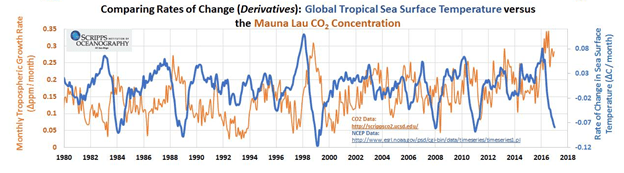
Changes in CO2 concentration rapidly follow changes in sea surface temperature as shown in the following graph.
References:
Bolin, Bert. 1960. On the Exchange of Carbon Dioxide between the Atmosphere and the Sea, Tellus, 12:3, 274-281, DOI: 10.3402/tellusa.v12i3.9402 To link to this article: https://doi.org/10.3402/tellusa.v12i3.9402
Bolin, Bert & Eriksson, Erik. 1959. Changes in the Carbon Dioxide Content of the Atmosphere and Sea due to Fossil Fuel Combustion. Pgs. 130-142. The Atmosphere and the Sea in Motion.
Sundt, Nick. 1995. IPCC Chairman Bert Bolin Builds Consensus. Center for Global Change. Archived from the original on 2002-11-16. Retrieved 2003-08-13. http://www.globalchange.org/profall/95jul16d.htm
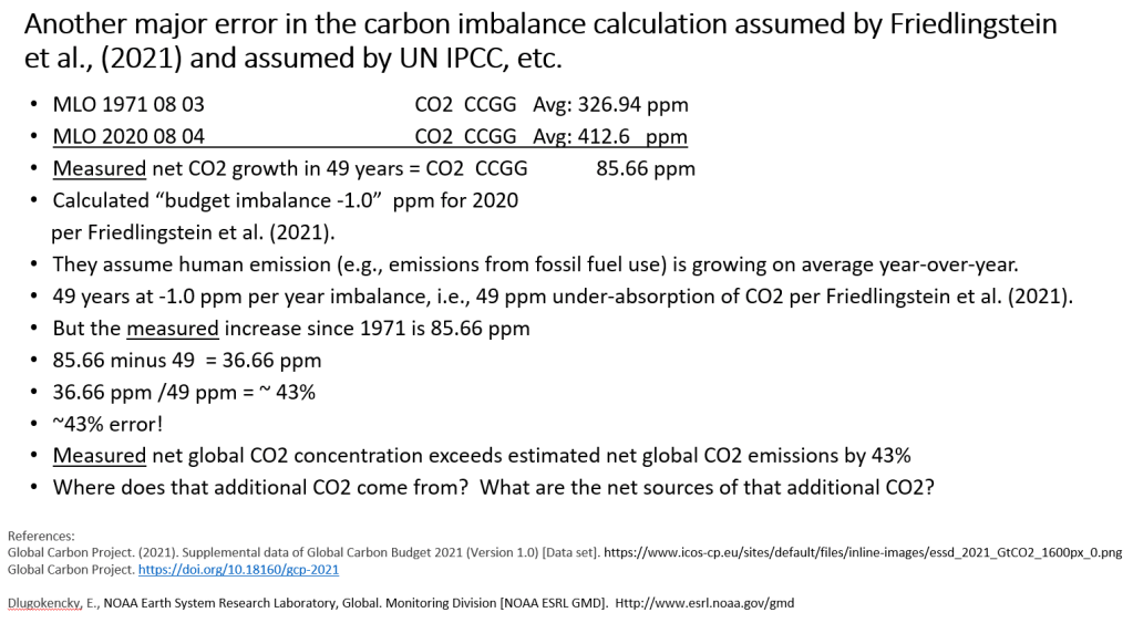
The error in Friedlingstein et al (2021) is much larger than expected. Friedlingstein et al Page 4: “total anthropogenic CO2 emission of 10.2 ± 0.8 GtC yr-1 (37.4 ± 2.9 GtCO2).”
The amounts above are their calculation, not mine.
Friedlingstein et al reported their estimate for 1 year’s (2020) increase for human fossil fuel emissions, land use and cement = 37.4 +- 2.9 Gt CO2. This is their estimate of emissions not net emissions. Net CO2 absorption has not been subtracted.
Follow this simple arithmetic:
• Using NOAA Mauna Loa data only (no estimates, no theories, no models, no assumptions.) Reported in micromoles/mole = ppm. • MLO did not report CO2 flask measurements on Jan 1, 2020 • 2 Jan 2020, MLO reported 4 CO2 flask measurements for Jan 2, 2020. Average 412.9875 ppm • 31 Dec 2020, MLO reported 4 CO2 flask measurement for Dec 31, 2020. Average 415.5225 ppm • CO2 increase due to all sources human and natural combined for year 2020 is 2.535 ppm, (i.e., 415.5 minus 412.9875) • 2.535 ppm CO2 per year times 7.76 Gt CO2 per ppm of CO2 = 19.679 Gt CO2 added to the atmosphere in 2020 from all sources human and natural.
• Thus, net CO2 added by humans cannot exceed 19.679 Gt CO2 in 2020, because this amount includes net CO2 additions by all sources.
• Net global average CO2 concentration reported by Mauna Loa on 31 December 2020, the average of 4 measurements that day was 415.5225 ppm. Multiply by 7.76 Gt per ppm = 3224.455 Gt CO2 total CO2 in atmosphere.
• Net Human CO2 added to air in 2020 cannot exceed 0.610% of total CO2 for 2020. This 0.61% includes net CO2 emissions and net CO2 absorptions from humans including cement, net CO2 from ocean, net CO2 from land, rivers, lakes, CO2 from rotting and decay, net CO2 from biosphere, etc.
37.4 Gt CO2 is the Friedlingstein et al estimate of human emissions only for 2020. It is an excessively complicated estimate. If you read the Friedlingstein et al paper you will see the complications, uncertainties, and assumptions. But that amount is human emissions only and only emissions, that is CO2 absorptions have not been subtracted from their estimated human CO2 emissions.
Net total CO2 added in 2020 was measured 19.679 Gt CO2. 37.4/19.7 = 52.7%, but this is an apples and oranges comparison. 19.7 is total emissions minus total absorption. 37.4 is human only and emissions only. Friedlingstein et al has a major problem. We do not know how much of that 37.4 Gt CO2 human emission was absorbed during 2020. But we do know that net human emissions cannot exceed 19.679 Gt CO2.
It is easily proven and observed that ocean is both a CO2 sink and a CO2 source. CO2 flux is non-stop in both directions, into and out of Earth’s surface. Earth’s surface is over 70% ocean. CO2 gas molecules continuously collide with ocean surface, day and night, regardless of season, temperature, or location; some of that CO2 is emitted back into air, and some is retained in the surface. The partition ratio of CO2 between gas in the surface versus gas above the surface is the Henry’s Law coefficient. The coefficient is a simple ratio of CO2 moles or mass; it varies with the local surface temperature. The resulting ratio is a dimensionless, intensive property of matter. Adding more CO2 to the air or to the ocean surface does not change the CO2 ratio. Diffusivity of a gas in a liquid is a function of the mass of the gas, specifically the inverse of the square root of the molecular weight of the gas. Humans, volcanoes, biosphere, etc., adding CO2 to the atmosphere does not change the Henry’s ratio or diffusivity of the CO2 gas into the ocean surface. The concentration of CO2 gas in the ocean surface and in the air at a given local surface temperature is given by the Henry’s Law coefficient plus or minus temporary perturbations due to alkalinity, surface or air disturbances due to winds, currents, and salinity at that location. The net amount of biosphere CO2 flux, another perturbation, is also non-stop in both directions when CO2 emissions due to decay are included. These perturbations adjust by CO2 emission or CO2 absorption and rapidly return to the Henry’s Law CO2 partition ratio.
Friedlingstein et al say on Page 9: “Global emissions and their partitioning among the atmosphere, ocean and land are in reality in balance.”
Friedlingstein et al calculate on page 32, section 3.4.2,“The observed stability of the airborne fraction over the 1960-2020 period indicates that the ocean and land CO2 sinks have been removing on average about 55% of the anthropogenic emissions (see sections 3.5 and 3.6).”
Apparently, Friedlingstein et al believe nature is in balance, except for humans. Apparently, they believe that nature, which balances 3224.455 Gt CO2 total CO2 in atmosphere by continuous emissions and absorptions, is unable to balance an additional estimated 37.4 Gt CO2 from humans. Nature is already balancing over 86 times more CO2 than their estimation of human emissions, (i.e., 3224.5/37.4) but for some unexplained reason they believe nature is unable to balance the relatively tiny human CO2 perturbation, a human amount which is much less than 0.61% of the total, (i.e., 19.7/3224.5) because that 0.61% includes net CO2 emissions from all sources and sinks, human and natural.
Even the above example understates the size of their error. Since net human emissions would be a cumulative net of two fluxes, if there were a method to measure it, and since net global average CO2 concentration (i.e., NOAA Mauna Loa) is the net of two giant CO2 fluxes in opposite vector directions, then we should compare these data as integral areas. (That is still an apples and oranges comparison because we only have the estimate of human emissions, not net human emissions. But at least the comparison would be in the right order of magnitude.)
Follow this simple arithmetic:
Friedlingstein et al estimate 37.4 Gt human CO2 emissions for 2020. For avoidance of doubt, this is not emission minus absorption.)
1 ppm CO2 equals 7.76 Gt CO2
37.4 Gt divided by 7.76 = 4.8195 ppm human CO2 emissions for 2020, call it 4.8 ppm
Then the comparison between total CO2 versus Friedlingstein et al estimated human CO2 emission would look something like the following graphic. We compare the entire area of the orange quadrangle to the area of the thin blue quadrangle. Absorptions of human CO2 emissions have not been subtracted. Nevertheless, it should be obvious that B is not causing A, and the orange area is enormously larger than the blue area.
Human emissions cannot be driving the growth rate (slope) observed in net global average CO2 concentration.
Net global average CO2 concentration in air today is the same as it would be if humans never existed.
K.W. Thoning, A.M. Crotwell, and J.W. Mund (2022), Atmospheric Carbon Dioxide Dry Air Mole Fractions from continuous measurements at Mauna Loa, Hawaii, Barrow, Alaska, American Samoa and South Pole. 1973-2021, Version 2022-05 National Oceanic and Atmospheric Administration (NOAA), Global Monitoring Laboratory (GML), Boulder, Colorado, USA. https://doi.org/10.15138/yaf1-bk21
It seems the ICSL and other groups are sold on the papers and conclusions of Friedlingstein et al, aka CDIAC, which is about 50 authors, and their 16 annual reports on global carbon budget. But facts and evidence do not support the elaborate and overly complex models and assumptions in Friedlingstein et al.
For example, Friedlingstein et al, assume that only about 50% of human emissions are absorbed by the environment. Why? How? This assumption is apparently based on their complex estimates of human CO2 emissions and slope of human CO2 emissions in a well-hidden correlation with the net global average atmospheric CO2 concentration reported by NOAA/Scripps Mauna Loa. First, this is an apples and oranges comparison. Second, facts, experimental data and statistical analysis do not support that correlation. And, even if that correlation were supported by evidence, as we all know and frequently ignore, correlations do not prove a cause-and-effect relationship exists. It is essentially a “plug” to make the numbers come out as they wish. Friedlingstein et al and their followers assert the so-call “airborne fraction” argument.
Professor of statistics Jamal Munshi and others have shown that the assumed correlation is spurious. Professor Munshi explains the problems with the “airborne fraction” argument:” there is a mass balance problem with the causation hypothesis that fossil fuel emissions cause atmospheric CO2 concentration to rise. The mass balance shows that the assumed equality of annual fossil fuel emissions and annual rise in atmospheric CO2 is not found in the data. What we find instead is that annual emissions tend to be greater than the annual emissions needed to explain the observed annual change in atmospheric CO2. The explanation for this paradox offered by climate science is that the excess emissions are somehow removed from the atmosphere by carbon cycle flows so that not all the emissions end up in the atmosphere but no mechanism and no empirical evidence for this removal are offered. The portion of annual emissions used to explain the annual change in atmospheric CO2 concentration is called the “Airborne Fraction“.
That the excess annual emissions not explained by annual change in atmospheric CO2 must therefore go somewhere else and if we look through the large carbon cycle flows maybe we can find a way to explain this paradox with the possibility but not the evidence that the missing CO2 goes into carbon cycle flows is a case of circular reasoning and confirmation bias. These data are interpreted as evidence that about half of the annual emissions stays in the atmosphere {The Airborne Fraction}and causes atmospheric CO2 to rise {to cause warming} and that the other half must therefore be absorbed by nature’s carbon cycle flows to one or more of the sinks in the carbon cycle system.
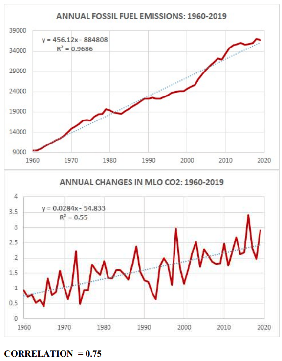
Friedlingstein et al, IPCC and followers of the human-CO2-caused climate agenda look at the following two graphs and conclude that there is a correlation between fossil fuel emissions and net global atmospheric CO2 concentration. Yes, there is a strong correlation. But they have not done the statistics properly.
Munshi, J. (attached)
Some of those people look at the two graphs above and notice that the two trends are diverging, and calculated fossil fuel CO2 emissions are growing faster than necessary to explain the trend in net CO2 concentration. The gap between the two trends they call the “Airborne Fraction”. If you struggle through reading Friedlingstein et al, you will see that the Airborne Fraction is obfuscation and fudge factors, and uncertainties are not resolved.
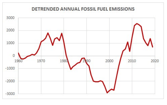
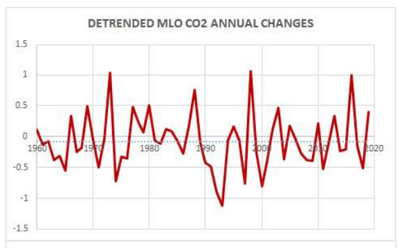
If instead you do proper statistics with these two data sets as is done here by Dr. Jamal Munshi, then you detrend these two data sets to removed the shared time-line and then re-run the correlation statistics.
Munshi, J. (attached)Munshi, J. (attached.)
The correlation disappears when the two data sets are detrended. The apparent correlation was due to the time-line shared between the two data sets.
CIRCULAR REASONING AND CONFIRMATION BIAS: The problem is that this airborne fraction explanation of the emissions mass balance anomaly is a case of circular reasoning and confirmation bias as follows. The airborne fraction was not independently determined from theory but found in the data. A hypothesis was then derived from the datathat the excess emissions not explained by the change in atmospheric CO2 are removed by the carbon cycle. This hypothesis was then tested with the same data used to construct the hypothesis. This kind of hypothesis test contains the circular reasoning fallacy. A hypothesis derived from the data cannot be tested with the same data.” (Munshi, attached.)
Bromley and Tamarkin (2022) and my addendum (attached) with a more conservative calculation show that Earth’s environment demonstrated the capacity to remove in 2 years more than 25 times the total of all CO2 from all sources which had been added to the atmosphere since daily measurements began reporting at Mauna Loa in May 1974 through June 15, 1991. The net CO2 addition from all sources as of June 15, 1991 was 194 Gt CO2. That is more than 5 times the amount of CO2 emissions (37.4 Gt CO2 estimated emissions only, not net emissions) estimated by Friedlingstein et al to have been added to the atmosphere by humans in 2020.
Friedlingstein et al assume the fossil fuels emissions data, cement emissions data, etc to be fact, when in fact they are only estimates. In this context, they are not fact, because they do not know how much of those emissions are absorbed; could be less than 1% absorbed or could be 100% absorbed. They use the estimates of fossil fuel emissions in the calculation to attempt to explain the “Airborne Fraction”. The result is more uncertainty. The Mauna Loa data is the net residual difference between two fluxes that are each much larger and with much large variations than the residual difference which is the net global average CO2 concentration which MLO reports. Friedlingstein et al attempt to use a tiny fraction (i.e. estimated fossil fuel emissions) of a fraction (i.e. the annual increase in the residual difference) of two CO2 fluxes to explain the much larger variations in the residual net global average CO2 concentration measured at Mauna Loa. It should be no surprise that there is no correlation.
Where is the evidence that human emissions are NOT entirely absorbed? Evidence does not support an assumption that the environment would treat human emissions differently than other CO2 emissions and absorptions. In view of the very high solubility of CO2 in ocean water, the relatively high 40:1 to 50:1 ratio of dissolved inorganic carbon in ocean water versus CO2 gas in air, the giant carbonate cliffs, caves, and mines of calcite, limestone, etc found around the world, thus the assumption that CO2 emitted is not also absorbed is non sequitur and specious. And that non sequitur is now more obvious after Bromley & Tamarkin (2022).
I have started a paper which is a critique and rebuttal to Friedlingstein et al. Yes, there are more substantive arguments. Friedlingstein et al. have enormous resources and I have none. Plus, they have 16 years-worth of their annual carbon budget reports that need review. Their models are excessively complex and loaded with assumptions and estimates, but this complexity is not necessary to the problem at hand. Volunteers welcome.


You must be logged in to post a comment.